Augmented Portal
Studio is being deprecated, please head over to the documentation page for Mattercraft, our most advanced 3D tool for the web, where you can find the most recent information and tutorials.

Difficulty Level: Easy
Coding Knowledge Required: Absolute Beginner
Time to Complete: 30 minutes
Masking is a technique that hides parts of a scene as if they were behind an invisible object. It can be used to create environments that extend behind, and are framed by, a target image.
This super simple experience is one of the most popular AR interactions with users. Following along with this tutorial will provide you with the basics of creating your own masked scenes in ZapWorks Studio.
If you get stuck, please refer to our extensive Documentation or check out the Forum, a handy way to ask questions of other ZapWorks users. You can also take a look at the completed project.
Step by Step
Section titled “Step by Step”1. Create a new Studio Zapcode
Enter your my.zap.works account and click the ‘Make a New Zapcode’ button in the top left. Give your code a name, and choose between either a circle or lozenge style and select ‘Studio’ as your tool. Widgets and Designer codes will not work for this tutorial.
2. Create a new project in ZapWorks Studio
Open ZapWorks Studio (download here) and create a ‘New Project’.
Choose to start with a ‘Blank’ template and give your project a name, e.g. “Masked Scene” and click ‘Create’.
3. Download the asset pack
Click here to download a zip file containing all the assets we’ll need for this experience.
4. Import image files into the Media Library
Unzip the file you downloaded in step 3 and drag the files from the ‘Image Asset’ folder into the Media Library import box, located in the top right of the window. You can select multiple files and import them at the same time.
5. Train tracking image
Tracking Images are images that content appears attached to as they move around in the camera view.
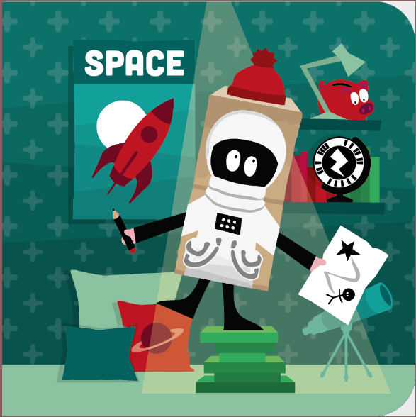
Click the plus (+) sign in top right of the Media Library. From the dropdown, select ‘Train Image File’. This will open up your Explorer / Finder and allow you to select your tracking image, named “Space Page.png”, in the folder ‘Tracking Image’.
The image will then be trained. During this process, which may take up to a minute, the image is analysed from multiple angles and a target file is produced. This file is added to your Media Library, with the file extension ZPT.
6. Drag your target into the Hierarchy
Drag your target file from the Media Library into the root node within the Hierarchy.
Once in the Hierarchy a preview of the target will appear in the 3D view. The icons at the bottom right of the screen can be used to move the target in the view, just as if it were being physically moved in a camera view.
Targets in the Hierarchy act like groups. Content placed inside a target will appear attached to it in the 3D view and when viewed in the app.
7. Create a group to keep your Hierarchy organised
In order to keep the items in your Hierarchy organised, we are going to create a group. Right click on the target and select ‘New > Group’. Name this new group “Scene Ornaments”.
Groups are incredibly useful for organizing your content. When you create more complex experiences it is good practice to use groups where appropriate.
8. Add the wall asset into the scene ornaments group
Click and drag the wall.png from the Media Library and into the Scene Ornaments group.
Once completed, you will be able to rotate the target in the 3d view and see that the wall is tracked to the target image.
9. Position and scale the wall
Click on the Wall in the Hierarchy. Using the Properties panel on the left hand side below the Hierarchy (image attached), scroll to find the ‘Transform’ section.
Set the position and scale the wall as follows:
Position (0, 0, -5)Scale ( 10, 10, 10)Rotation ( 0, 0, 0)10. Make the wall invisible
You are now going to make the wall invisible. This will allow you to easily position the rest of the items correctly in the scene. You will make it visible again once you have everything where you want it.
Making sure that the wall is still selected, scroll in the Properties panel to the ‘Appearance’ section and untick visible.
11. Positioning the rest of the content
Click on the ‘Set View’ option in the top right of the 3D view (it should look like an eye icon) and select ‘Front’. This allows us to view the target image straight on, useful for lining up our content.
You will now set up the rest of the scene. Drag the remaining files into the scene ornaments group beneath the previous object in turn. Follow the coordinates below to position each object accordingly.
It is important to make sure that each new asset sits underneath the previous one in the Hierarchy. This is because the order in the Hierarchy determines the order of rendering on screen.
11.1) Position the telescope
Place the telescope below the wall within the Hierarchy.
Position (1.07, -0.95, -3.00)Scale ( 0.5, 0.5, 0.5)Rotation ( 0, 0, 0)11.2) Position the cushion
Place the cushion below the telescope within the Hierarchy.
Position (-0.70, -1.05, -4.00)Scale ( 0.63, 0.63, 0.63)Rotation ( 0, 0, 0)11.3) Position the books
Place the books below the cushion within the Hierarchy.
Position (0.25, -0.99, -2)Scale ( 0.4, 0.4, 0.4)Rotation ( 0, 0, 0)11.4) Position the poster
Place the poster below the books within the Hierarchy.
Position (-0.72, 0.72, -4.90)Scale ( 0.9, 0.9, 0.9)Rotation ( 0, 0, 0)11.5) Position the shelves
Place the shelves below the poster within the Hierarchy.
Position (1.1, 0.75, -4.90)Scale ( 0.6, 1.2, 1.2)Rotation ( 0, 0, 0)12. Creating a floor
Drag the Plane object from the Media Library into the Hierarchy. Place the Plane beneath wall.png and above telescope.png. Right click on the plane node and rename it as ‘Floor’.
12.1) Position the floor
Position (0.0, -1.5, -2.5)Scale ( 5, 2.5, 1)Rotation ( -90, 0, 0)We have rotated the floor so that it is coming towards us from the target image. This will be important in giving the impression of depth.
12.2) Set the floor color
Remaining in the Properties section, head to the ‘Appearance’ section and then click the color box, and set the HEX value to #ff7ebb93.
13. Make the wall visible
Click on the wall in the Hierarchy, head to the Appearance section of the Properties panel and check the visible box.
14. Set scene ornaments to test_3d
You are now going to set the layerMode of the objects in our Scene Ornaments group to test_3d. Start from the wall and go through the Scene Ornaments group.
Click the object node, then within the Properties panel, scroll to the ‘Appearance’ section and change the layerMode from overlay to “test_3d”.
Do this individually for each item in the Scene Ornaments group.
Changing the layerMode to
test_3dmeans that these objects will have to be closer to the camera than othertest_3dorfull_3dobjects in order to be visible.
15. Create a square mask in the Media Library
Click the (+) icon in the Media Library and select the ‘Square Mask’. This will add a Square Mask into your Media Library.
16. Drag Square Mask into the Hierarchy
Drag your Square Mask from the Media Library into the target file. Make sure that the mask is above the Scene Ornaments group in the Hierarchy.
17. Set the Square Mask layerMode to full_3d
Click on the Square Mask in your Hierarchy. Go into the Properties panel and in the Appearance section, set the layerMode to full_3d.
The mask object will still hide the other objects but will be drawn to the screen first.
18. Set the transparency of the Square Mask to 0%
Click on your Square Mask within the Hierarchy. Head to the ‘Appearance’ section of the Properties panel and click the color box.
This will open a dialogue box. Set the transparency to 0% and click ‘OK’ to close the box.
The mask object now will not be visible but will still hide the objects behind it.
19. Previewing your experience
At this stage the experience can be previewed on a device. If you do not have it already, download the Zappar App on Android or iOS to preview on your smartphone / tablet.
You can preview your Zap by clicking the ‘Preview’ button in to top left of your ZapWorks Studio. Use the target image below to test whether you are happy with your scene.

You will be asked to authenticate your ZapWorks account.
20. Publishing your experience to your zapcode
Hit ‘Publish’ in the top left corner to publish it to your previously created zapcode.
Choose the zapcode that you created in Step 1.
The code must be a Studio code in order to be published to.
Congratulations!
That’s it. You have completed all the steps in this tutorial and created your own masked scene. You are well on your way to learning ZapWorks Studio. Nice!
Suggested Next Steps
Section titled “Suggested Next Steps”- Add a 3D model to the scene to give a mixture of 2D and 3D elements.
- Make your own target image and add your zapcode to it.
- Create a cool opening animation to progressively reveal the mask.
Further Reading
Section titled “Further Reading”To learn more about the concepts covered in this tutorial, please see the following pages:
- Masking Objects - More information on the masking process.
- Tracking Images - How tracking images work.
- Using layerMode - Further details on all layerModes.