Web Button
Studio is being deprecated, please head over to the documentation page for Mattercraft, our most advanced 3D tool for the web, where you can find the most recent information and tutorials.
The Web Button subsymbol creates an interactive button that when tapped, launches the website at the URL specified.
The Business Card example project uses a Web Button subsymbol.
Creating a Web Button Symbol
Section titled “Creating a Web Button Symbol”A Web Button symbol can be added to your project by clicking on the plus icon + from the Symbol Definitions panel, and selecting it from the Buttons options.
Using a Web Button Symbol
Section titled “Using a Web Button Symbol”-
Drag the Web subsymbol from Symbol Definitions, into the Hierarchy in the parent symbol.
-
Select the Web Button node and add a website to the Website URL field.
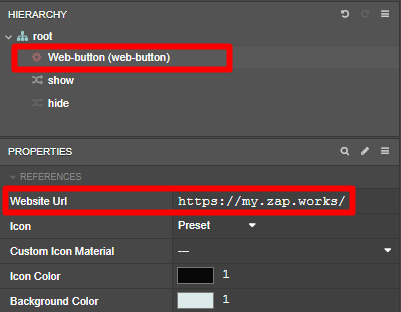
The Web Button symbol has five custom properties that can be edited:
| Property | Description |
|---|---|
| Website Url | Sets the website to launch. |
| Icon | Sets whether to use the button’s preset icon or a custom one. |
| Custom Icon Material | Sets the image to use as the button’s icon, if Icon is set to Custom. |
| Icon Color | Sets the color of the button icon. |
| Background Color | Sets the color of the button background. |
To use a custom icon instead of the default graphic, change the Icon property to custom and set the Custom Icon Material property to your imported image.