Navigating the UI
Studio is being deprecated, please head over to the documentation page for Mattercraft, our most advanced 3D tool for the web, where you can find the most recent information and tutorials.
ZapWorks Studio is our tool for building fully-interactive, 3D-capable, augmented reality (AR) experiences. Studio has been designed with ease-of-use in mind, meaning you can very quickly get started creating AR content, regardless of your experience with scripting, or 3D models.
In this first part of our Getting Started guide, we’ll introduce Studio’s interface (UI) and the role each of the sections play when creating your experiences, with later parts going over Studio’s core functionalities and their usage.
The first time you open Studio you’ll be taken through a brief introductory tour around the UI. You can launch this again at any time via the Help option located on the top right of the UI.
Media Library
Section titled “Media Library”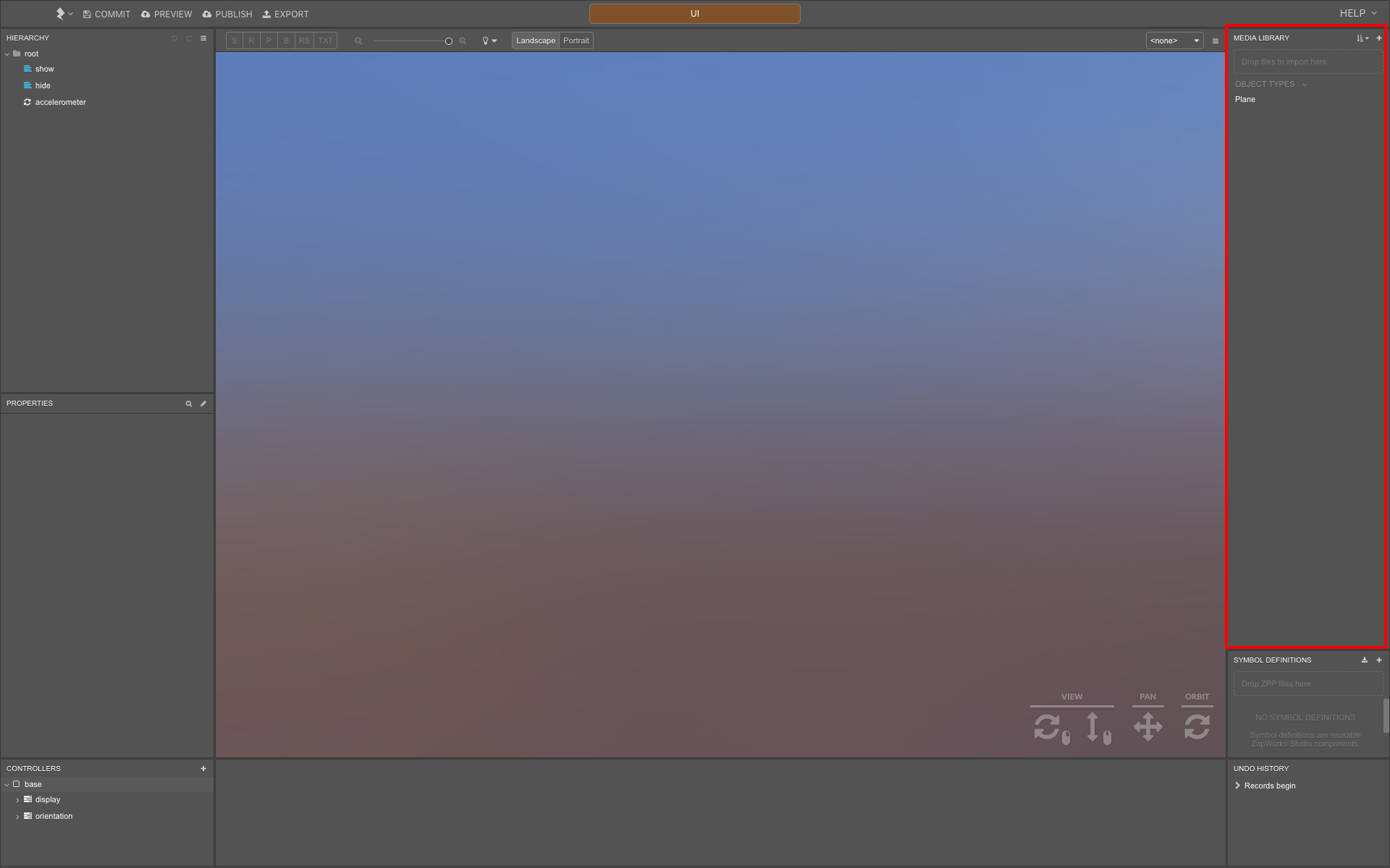
Assets you’d like to use in the current scene, including images, videos, audio, fonts, and 3D models are all imported to the Media Library, either by dragging them in or via the + icon menu.
Images to be used as targets for image-tracked experiences need to be trained via the option in the + icon menu, rather than imported as a standard image file.
Within the same dropdown you’ll also find the option to import a 3D model from Sketchfab, or one of Studio’s built-in objects such as masks, photospheres and fonts, among others.
By default, the Media Library contains a single asset, a Plane object, which can be used to display images or create interactive areas.
Hierarchy
Section titled “Hierarchy”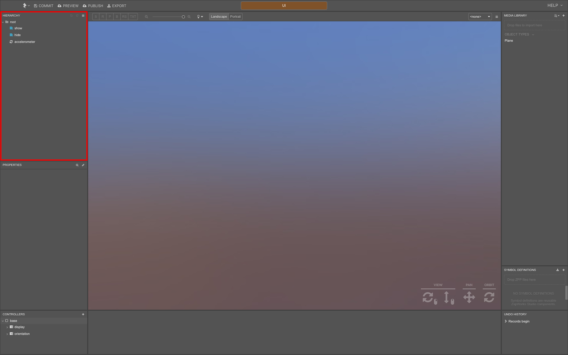
The Hierarchy displays a list of everything present in the current scene, including media files, groups, script nodes and subsymbols.
Media files imported to the Media Library aren’t automatically added to the scene, they first need to be dragged into the Hierarchy in order to create an instance of them.
Images added to the Hierarchy are essentially a Plane object with its material set to the image file from the Media Library.
Nodes in the Hierarchy can be grouped together, making it easier to manage projects with a large number of content. The position, scale, and rotation of objects are relative to the group they belong to. The root node in the Hierarchy itself is a special group which all content is relative to by default.
To create a new group, right-click the root node (or an existing group node) and select New > Group.
The position of content in the Hierarchy determines the order they are rendered in within the viewport. Nodes further down the Hierarchy have higher render priority than those above them, though this behavior can be changed on a per-object basis. For more information please refer to the Render Order article.
Viewport
Section titled “Viewport”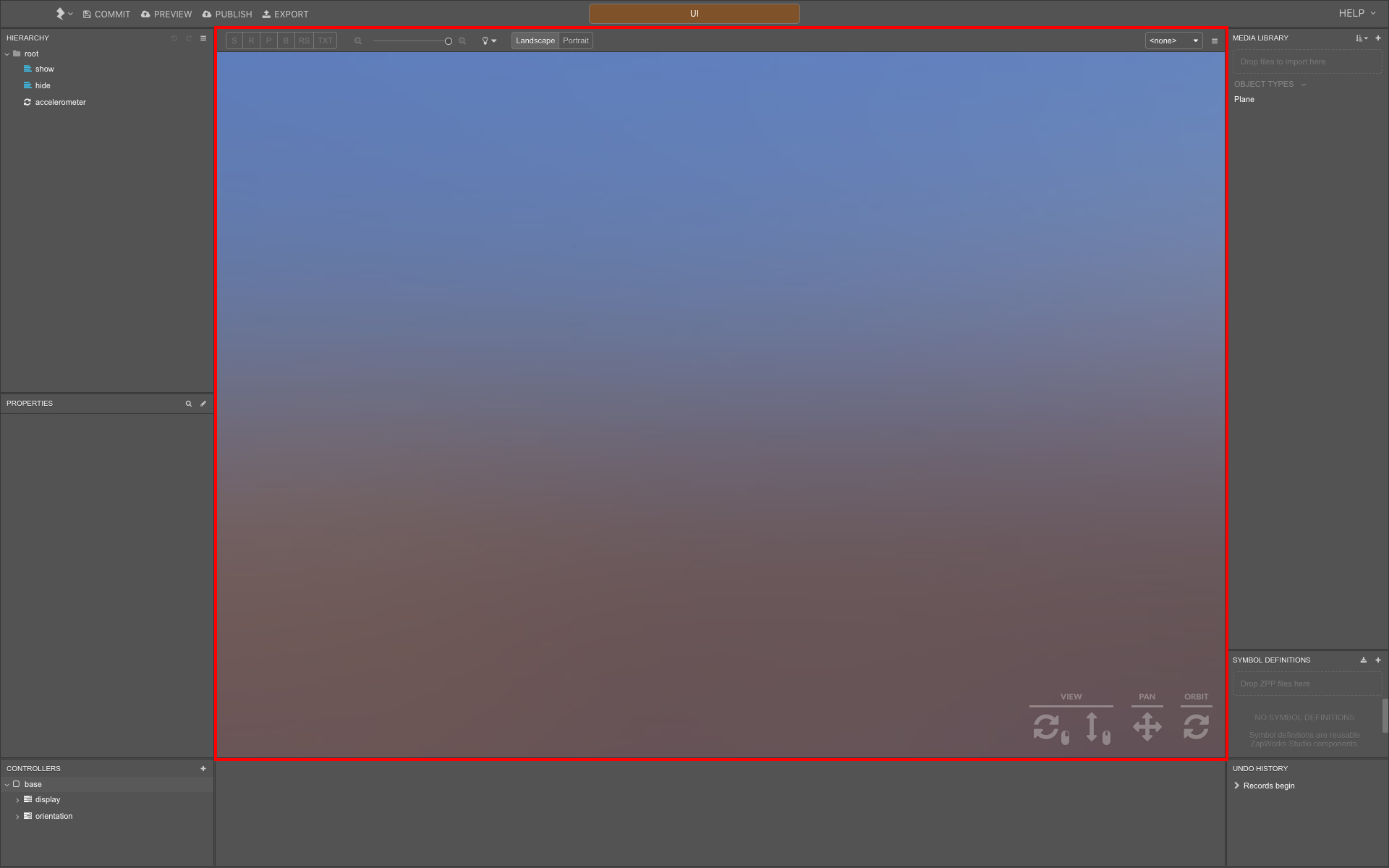
Nodes in the Hierarchy are displayed within the viewport at the center of Studio’s UI.
The controls at the bottom right of the viewport are used to navigate around the view, and target, in the scene, whereas the S, R, and P buttons above and to the left of the viewport control the selected object’s transforms (scale, rotation, and position, respectively).
To the right of the latter options you’ll find the zoom level, simulated lighting setting, and orientation options for the viewport. Further right still you’ll find the burger menu, which contains options to reset the view, change the background color, and simulate a specific device’s aspect ratio to preview how an experience will be displayed across multiple devices.
To keep the position of content across devices consistent, we recommend making use of the relative to property. For more information please refer to the UI Coordinate Systems article.
Properties
Section titled “Properties”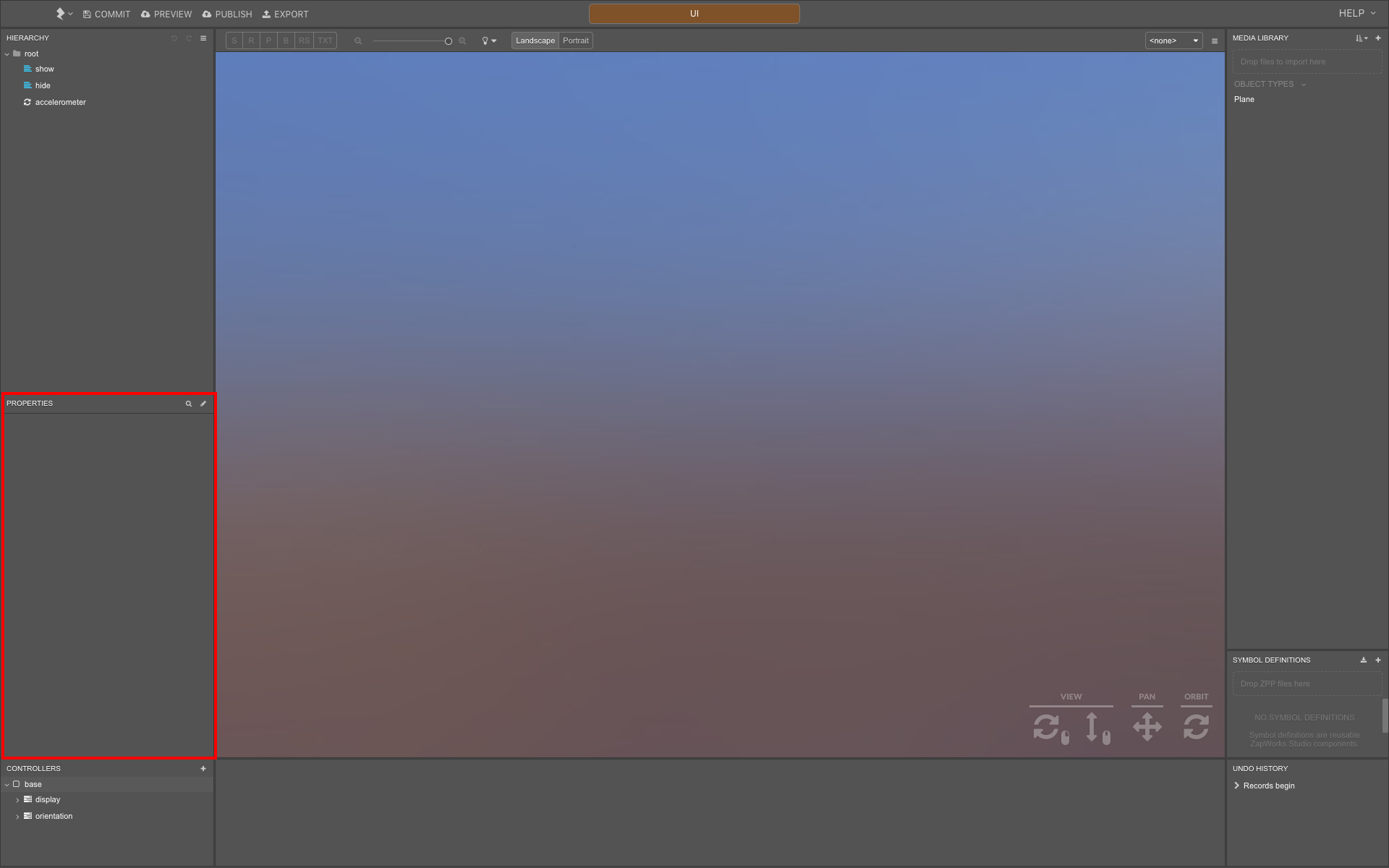
The Properties panel displays a list of properties for the node currently selected in the Hierarchy. The properties displayed will vary depending on the node’s type.
As well as the viewport shortcuts, a node’s transform properties can also be edited from within the Properties panel, under the Transforms tab.
Controllers
Section titled “Controllers”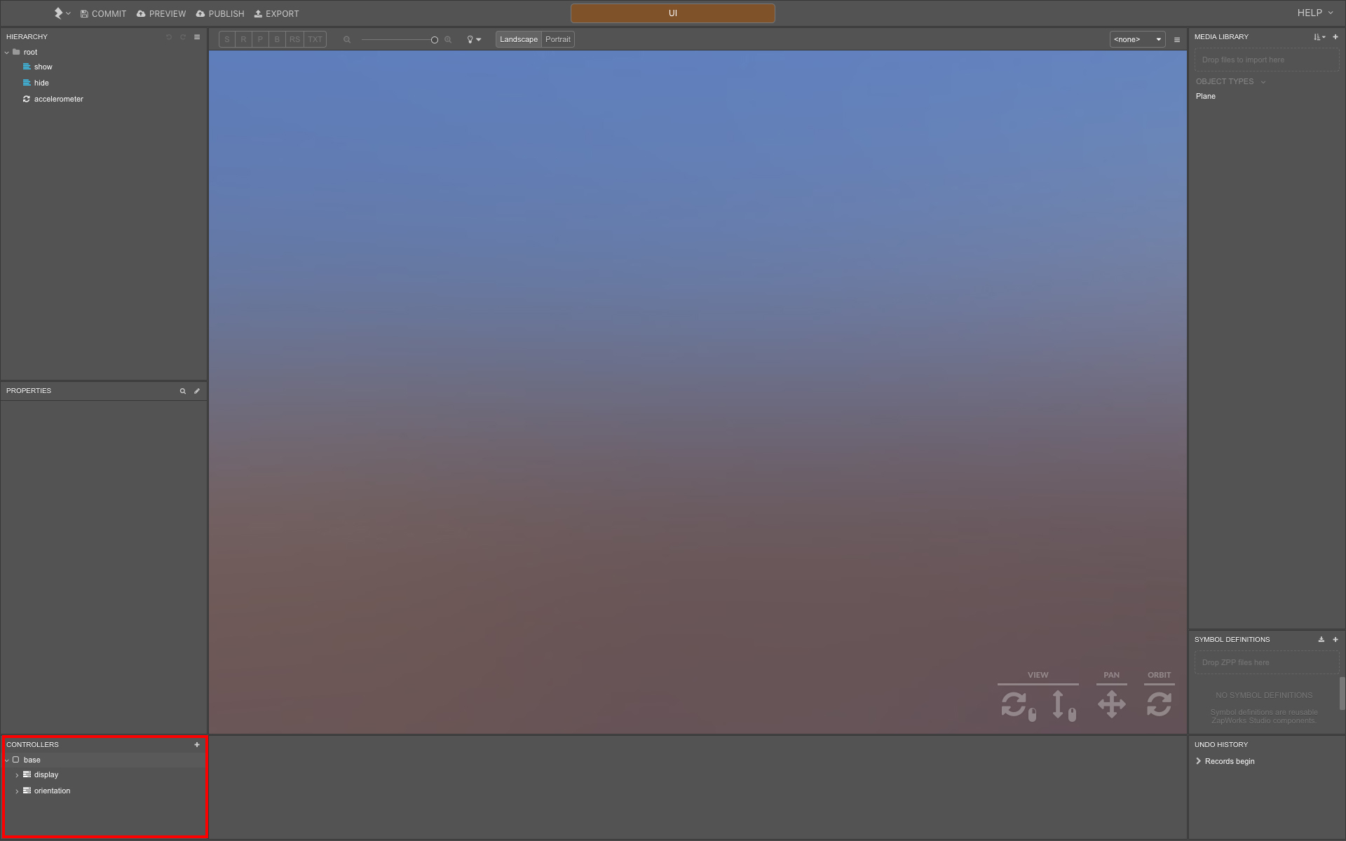
Below the Properties you’ll find the Controllers panel, which displays a list of controllers in the current scene, as well as the states and timelines that each one contains. A node’s properties can be edited within these states and timelines to create custom animations.
Controllers, states, and timelines will all be covered in greater depth in later sections of the Getting Started guide.
Symbol Definitions
Section titled “Symbol Definitions”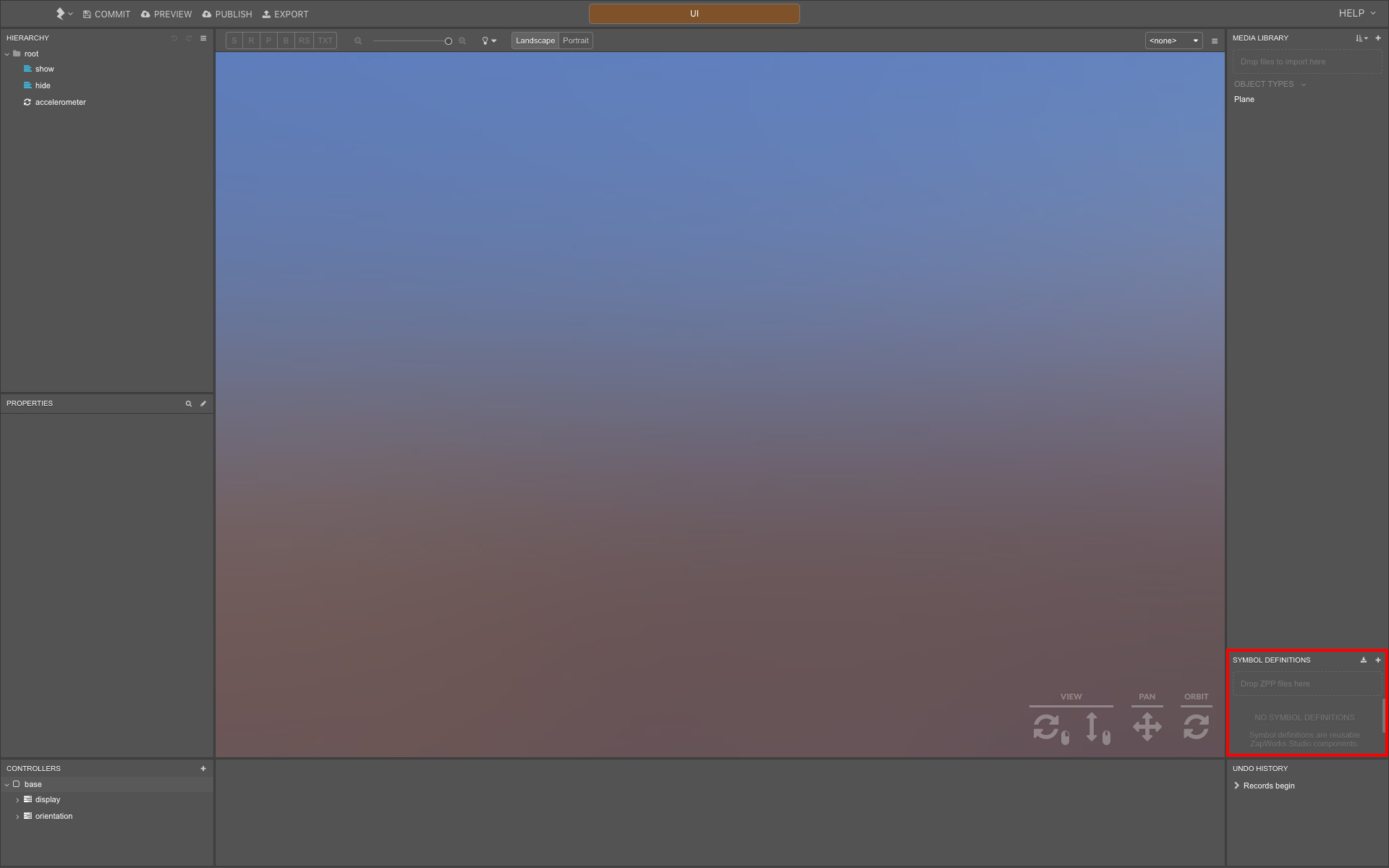
The first screen displayed when we create a new project is known as our root symbol. Studio’s modular design allows for the creation of subsymbols which can be used to abstract functionality away from our root symbol e.g. building a photo feature segment as part of the main experience.
After being imported to the Media Library, 3D models are added as subsymbols.
The Symbol Definitions panel lists all of the subsymbols imported to the current symbol, whether they are templates from the + icon menu or imported zpp files. The subsymbol templates provided allow you to add common functionality to your experience, without having to build it from scratch, though the blank and screen symbol options can be used to work on a blank canvas.
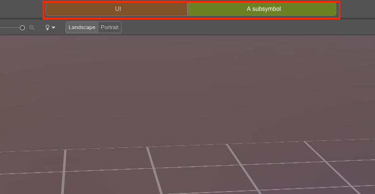
Double-clicking a subsymbol will enter its symbol view, displaying the subsymbol’s own Media Library, Hierarchy, etc. The breadcrumb bar at the top of the UI can be used to navigate back to the current symbol’s parent symbol.
Title Bar
Section titled “Title Bar”
To the left of the breadcrumb bar are project-level options such as the ability to preview, publish, or export the current experience.
While Studio projects are saved automatically, the Commit option allows you to save the current state of the project, allowing you to revert back to it in future.
Lastly, the options in the Lightning Bolt menu allow you to create a new project, open an existing one, or revert to a project’s previous commit. You’ll also find the options to sign in or out of ZapWorks or Sketchfab here.
Next article: Types of Tracking