Creating Custom Components
Components define the different types of Nodes you can have in your project. Each component provides a set of functionalities and properties that you can add as nodes in your project’s Hierarchy, as many times as you like.
While there are many components included with Mattercraft (such as Box and Group) and many more can be added through libraries, it’s possible to write your own in TypeScript.
Understanding Custom Components
Section titled “Understanding Custom Components”Most components in Mattercraft wrap and extend the functionality provided by lower-level elements, be they HTML elements or the objects and concepts from Mattercraft’s primary rendering engine of choice, three. js.
To get the best out of your custom components, we recommend getting up to speed with three.js - it’s a fantastic open-source project with a vibrant community.
There are many reasons you might wish to build your components, for example:
- To build your own custom three. js-based objects.
- To integrate three.js code from other codebases or resources.
- To build your 3D shaders.
- To build components that interact with third-party APIs.
Components in Mattercraft are similar in concept to components in web frameworks like React - they wrap underlying elements (typically HTML/DOM in React, and three.js in Mattercraft) and provide structure around properties and updates to those elements.
Creating a Custom Component
Section titled “Creating a Custom Component”The easiest way to create a custom component is to start with a template. From the Project Panel you can add a new CustomThreeJSComponent which has the outline of a basic 3D component.
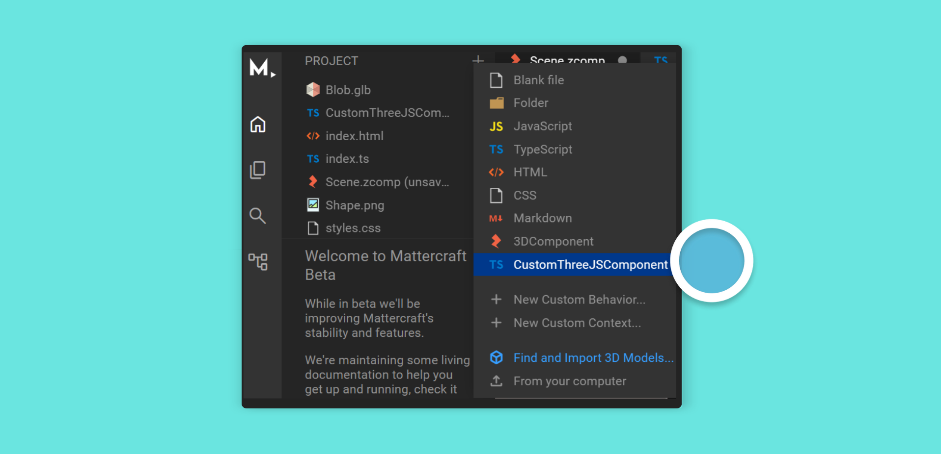
To add a new custom component to your Mattercraft project:
- Click the + (plus) icon button on the Project Panel
- Click CustomThreeJSComponent
- The Project Panel will now have this component script file with the skeleton of a brand-new component:
import { ContextManager, Observable, registerLoadable } from "@zcomponent/core";import { Group } from "@zcomponent/three/lib/components/Group";import * as THREE from "three";
interface ConstructorProps {
}
/** * @zcomponent * @zicon favorite */export class CustomThreeJSComponent extends Group {
    constructor(contextManager: ContextManager, constructorProps: ConstructorProps) {        super(contextManager, constructorProps);
        registerLoadable(contextManager, this._load());
    }
    private async _load() {
        const myObject = new THREE.Mesh(            new THREE.SphereGeometry(),            new THREE.MeshBasicMaterial(),        );
        this.element.add(myObject);
    }
    public dispose() {
        // Clean up any resources that have been created here
        return super.dispose();    }}
Components are TypeScript or JavaScript classes that ultimately extend the Component class provided by Mattercraft.
In the example above, the component extends Mattercraft’s
Groupcomponent. It wraps a three.jsGroupobject that you can use to hold custom 3D content. This means your component automatically has all the properties you would expect from a 3D object, such asposition,scale, androtation.
Inside the _load function, we construct a custom three.js Mesh object, passing in our desired geometry and material, then we add it to the THREE.Group object provided to us as this.element.
Just above the class definition, the @zcomponent annotation tells the Mattercraft editor that we’d like this component to appear in the Hierarchy Panel + (plus) menu and right-click menus; and thus make it easy to add to our 3D scene.
See Mattercraft’s full API documentation here.
Using a Custom Component
Section titled “Using a Custom Component”Once your component is constructed, you can add it as a child of the root Group node in your scene. Once added and selected in the Hierarchy, you can see your component’s properties in the editor.
Properties
Section titled “Properties”Just as with custom components, you can add properties to your behaviors that can be controlled from the 3D editor.
For more information, see the Properties article.
The Frame Loop
Section titled “The Frame Loop”When 3D experiences run in an end user’s browser, the 3D engine will draw, or ‘render’, the 3D scene up to 60 times every second. You may wish to run a script before each render frame.
To do so, first, make sure you import using:
import {useOnBeforeRender } from "@zcomponent/core".
You can then register a handler to the event returned by the useOnBeforeRender(contextManager) function.
For a full example, see our dedicated The Frame Loop article.
Documenting Your Components
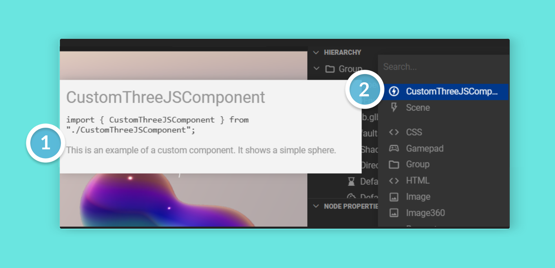
Section titled “Documenting Your Components”To make it easy to use your components in 3D scenes, it’s possible to add documentation in the script comment above your component’s class definition. Documentation is written using the popular JSDoc syntax.
/** * This is an example of a custom component. * It shows a simple sphere. * * @zcomponent * @zicon offline_bolt */export class CustomThreeJSComponent extends Group {
    constructor(contextManager: ContextManager, constructorProps: ConstructorProps) {        super(contextManager, constructorProps);
        // ...
        this.register(useOnBeforeRender(contextManager), dt => {            // This code is run every render frame            // dt is the number of milliseconds since the last frame        });    }
    // ...}
In addition, with the @zicon annotation, you can indicate what icon to show in the Hierarchy Panel. Any of the icons from Google’s Material Icon Set can be used - just lowercase the name and replace any spaces with an underscore.
For example, the Google Material icon name for Check Box will become
@zicon check_boxin Mattercraft.
Here’s how the component documentation and the custom icon look in the 3D editor: