Glossary
You can add documentation via comments in custom scripts to further clarify or add functionality in the Mattercraft editor using the popular JSDoc syntax.
See Mattercraft’s full API documentation here.
The Glossary below concerns terms specific to Mattercraft which can be used to add meaning and functionality to your Mattercraft project.
deprecated
Section titled “deprecated”Indicates node props which should not be shown in the Node Properties table.
Example usage
/*** This is an example to demonstrate how to deprecate node props* @zprop* deprecated*/testProp?: string;Node props will still be visible if the property has a value set or the Hide Deprecated Properties setting is turned off.
@zbehavior
Section titled “@zbehavior”Indicates a script is intended to create a custom behavior.
This behavior will show up as a script in the Left Menu and is a usable Behavior Action in the Mattercraft editor via the Behaviors Panel.
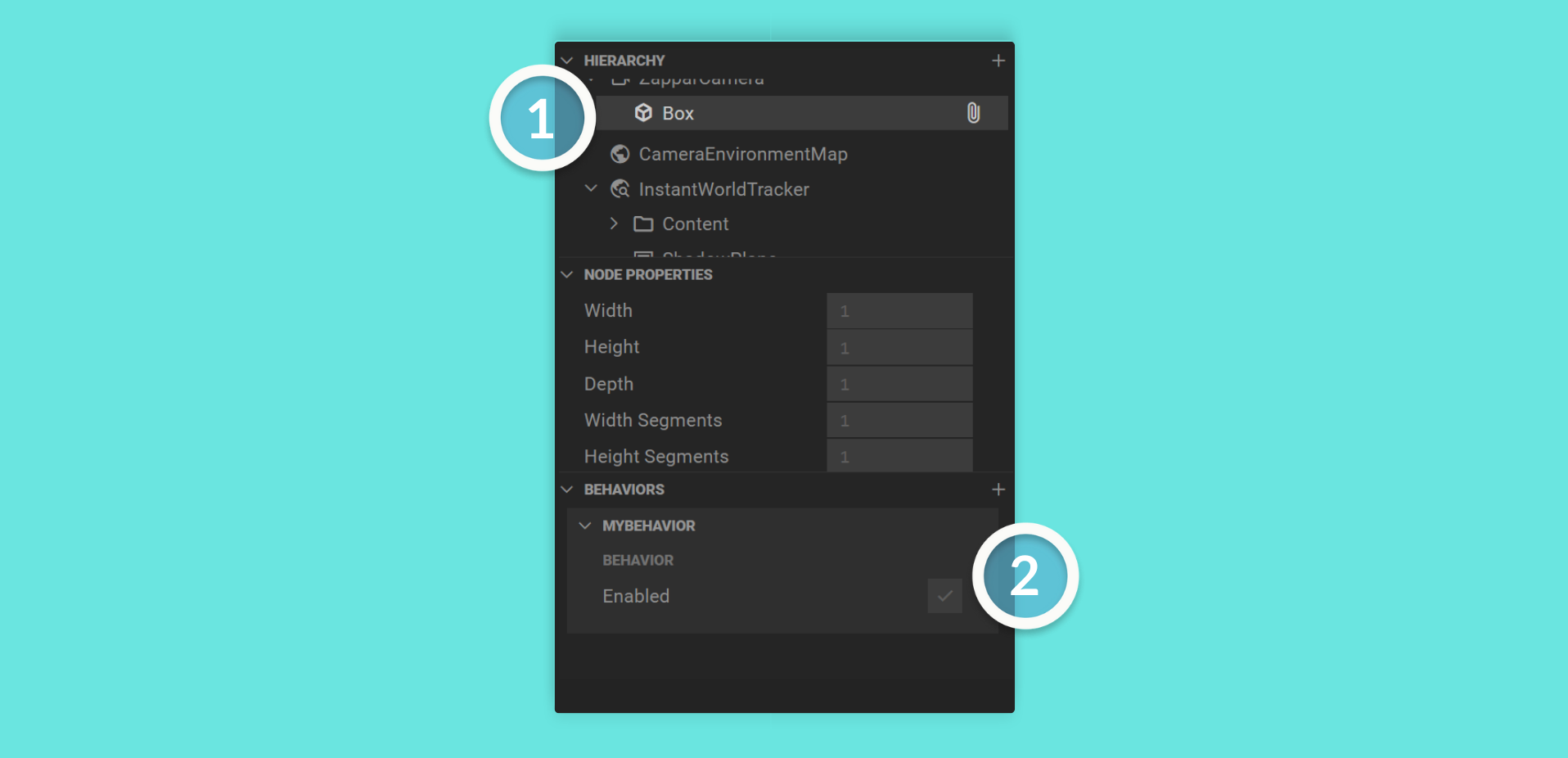
Example usage
/** * This is an example to demonstrate how to write custom behaviors * @zbehavior */export class MyBehavior extends Behavior<Box> { // ...}<! — ## zchildren —>
@zcomponent
Section titled “@zcomponent”Indicates a script is intended to create a custom component.
This component will show up as a script in the Left Menu and is a usable Component in the Mattercraft editor via the Hierarchy Panel.
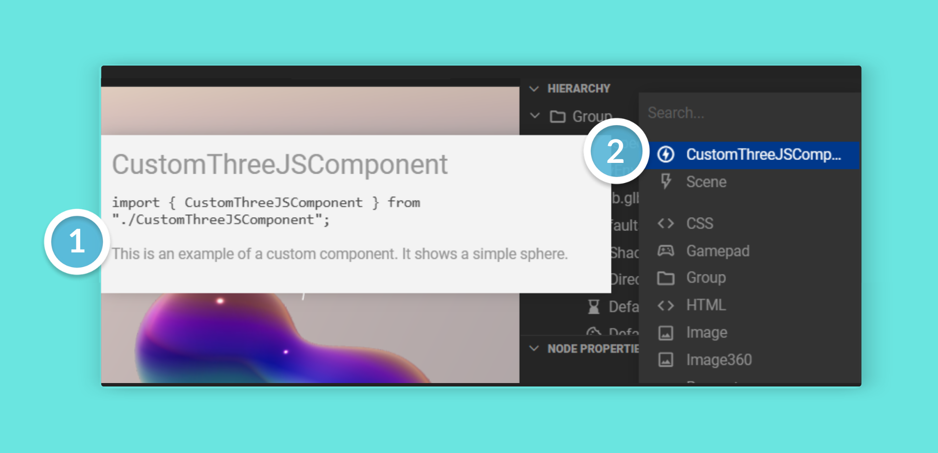
Example usage
/** * This is an example to demonstrate how to write custom components * @zcomponent */export class CustomThreeJSComponent extends Group { // ...}@zcontext
Section titled “@zcontext”Indicates a script is intended to create a custom context.
This context will show up as a script in the Left Menu and is omnipresent in your project. Therefore, it will run when you need it to.
Example usage
/** * This is an example context to demonstrate how to write custom contexts * @zcontext */export class MyContext extends Context<ConstructionProps> { // ...}@zdefault
Section titled “@zdefault”Indicates the default (and placeholder) value when creating a @zprop.
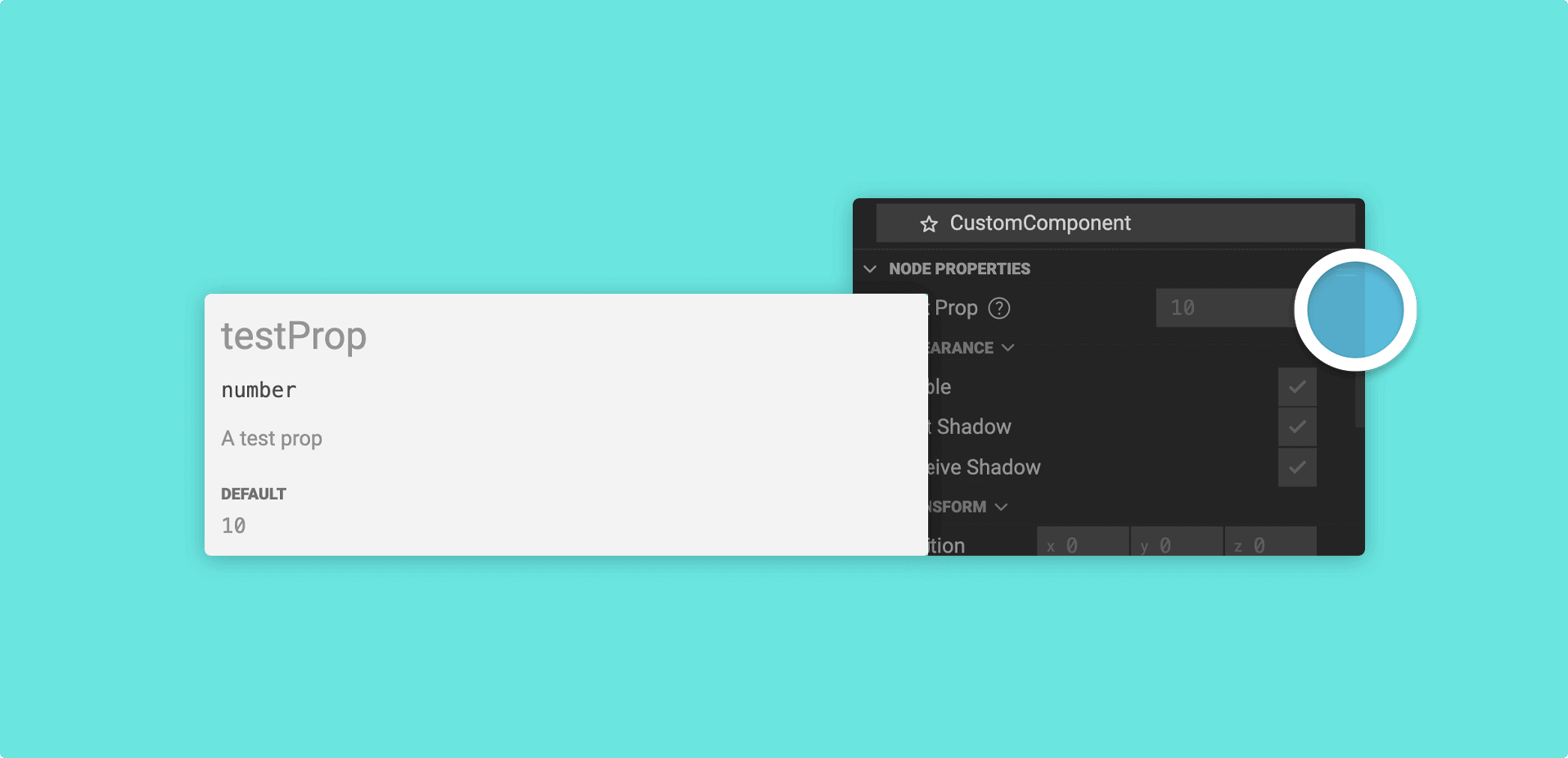
Example usage
/*** This is an example to demonstrate how to add a default value* @zprop* @zdefault 10*/testProp?: number;@zgroup
Section titled “@zgroup”Indicates either:
1. Which component group a custom component should be accessible from when you add it via the Hierarchy. This could be an existing group, or you can create a new one.
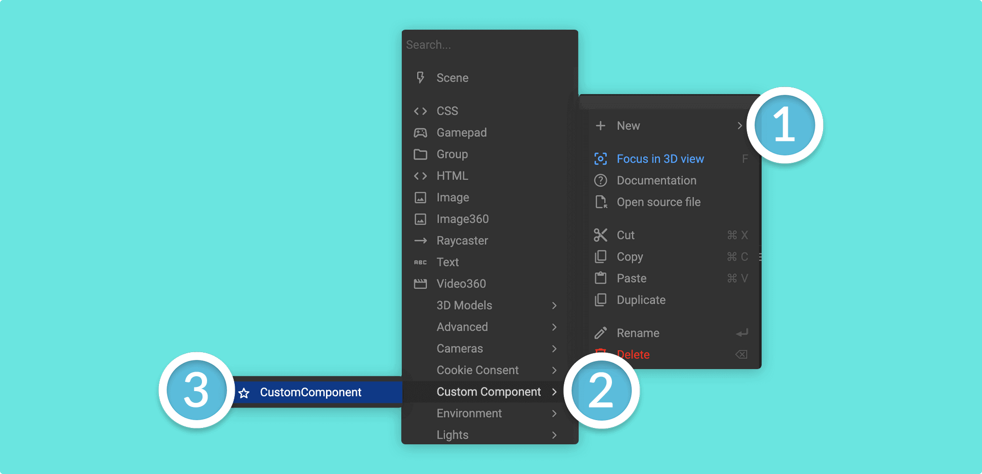
Example usage
/** * This is an example to demonstrate how to add a component to a component group * @zcomponent * @zicon star * @zgroup Custom Component */export class CustomComponent extends Group { // ...}2. The grouping of props in the Node Properties Panel.
Example usage
/*** This is an example to demonstrate how to add a prop to a node property group* @zprop* @zdefault 5* @zgroup Test props*/testProp1?: number;
/*** @zprop* @zdefault 10* @zgroup Test props*/testProp2?: number;
@zicon
Section titled “@zicon”Indicates what icon to show for this script in the Mattercraft editor. Any of the icons from Google’s Material Icon Set can be used - just lowercase the name and replace any spaces with an underscore.
Example usage
/** * This is an example to demonstrate adding an icon to a script * @zicon favorite * @zbehavior */export class MyBehavior extends Behavior<Box> { // ...}For example, the Google Material icon name for Check Box will become
@zicon check_boxin Mattercraft.
@zparents
Section titled “@zparents”Limits a node to definitions passed down by the parents.
Example usage
/** * This is an example to demonstrate how to define parents * @zcomponent * @ztag html/element/h1 * @zparents html/element/** * @zgroup Heading * @zicon html */export class H1 extends ZHTMLElement<HTMLHeadingElement> { constructor(mgr: ContextManager, props: HTMLElementProps) { super(mgr, props, document.createElement(‘h1’)); }}@zprop
Section titled “@zprop”Indicates a node property for a custom component.
Example usage
/*** This is an example to demonstrate how create a prop* An example prop* @zprop*/testProp?: string;You can add information about the prop by commenting above it. This will be accessible in the Node Properties Panel.
@zstream
Section titled “@zstream”Indicates if you are defining a media stream (such as video or audio).
Example usage
/** * This is an example to demonstrate how to define a media stream * @zcomponent * @zicon movie * @zgroup Media * @zstream */export declare class myVideo extends Object3D implements Stream { // ...}Indicates components this node can be added to.
Example usage
/** * This is an example to demonstrate how to create a tag * @zcomponent * @ztag html/element/h1 * @zgroup Heading * @zicon html */In the above example, this component would be unavailable in the root Group as it is tagged to appear under a specific category.
@ztype
Section titled “@ztype”Indicates what this input field’s type should be. Some examples of types include:
proportion- For a proportion sliderurl- For a website URLemailaddress- For an email address
Example usage
/*** This is an example to demonstrate how to indicate types* @zprop* @ztype url* @zdefault https://www.zappar.com/*/websiteURL?: string;@zvalues
Section titled “@zvalues”Indicates what values a prop field should take. A few examples of this could be:
files- For accepting file types such as .png/.mp3 etc.layerclipids- For accepting layer clipsnodeids- For accepting nodes in the Hierarchy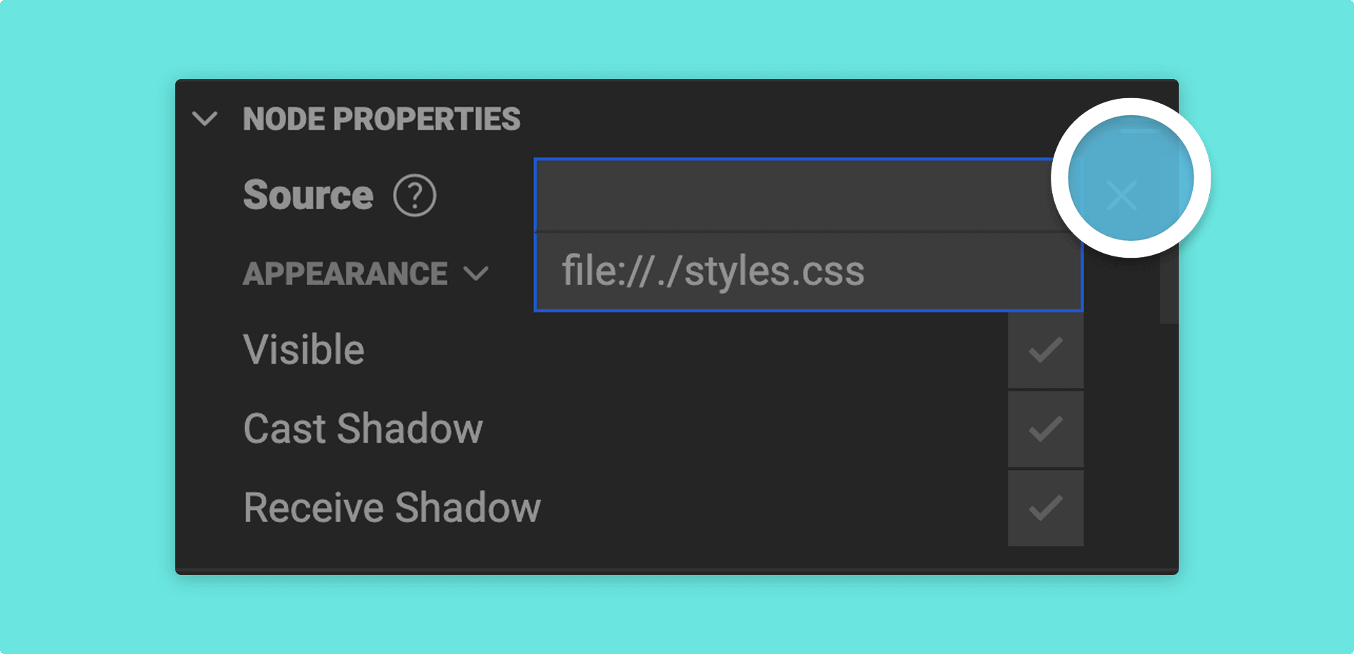
Example usage
/** * This is an example to demonstrate how to define a field value * @zprop * @zvalues files *.css */source: string;