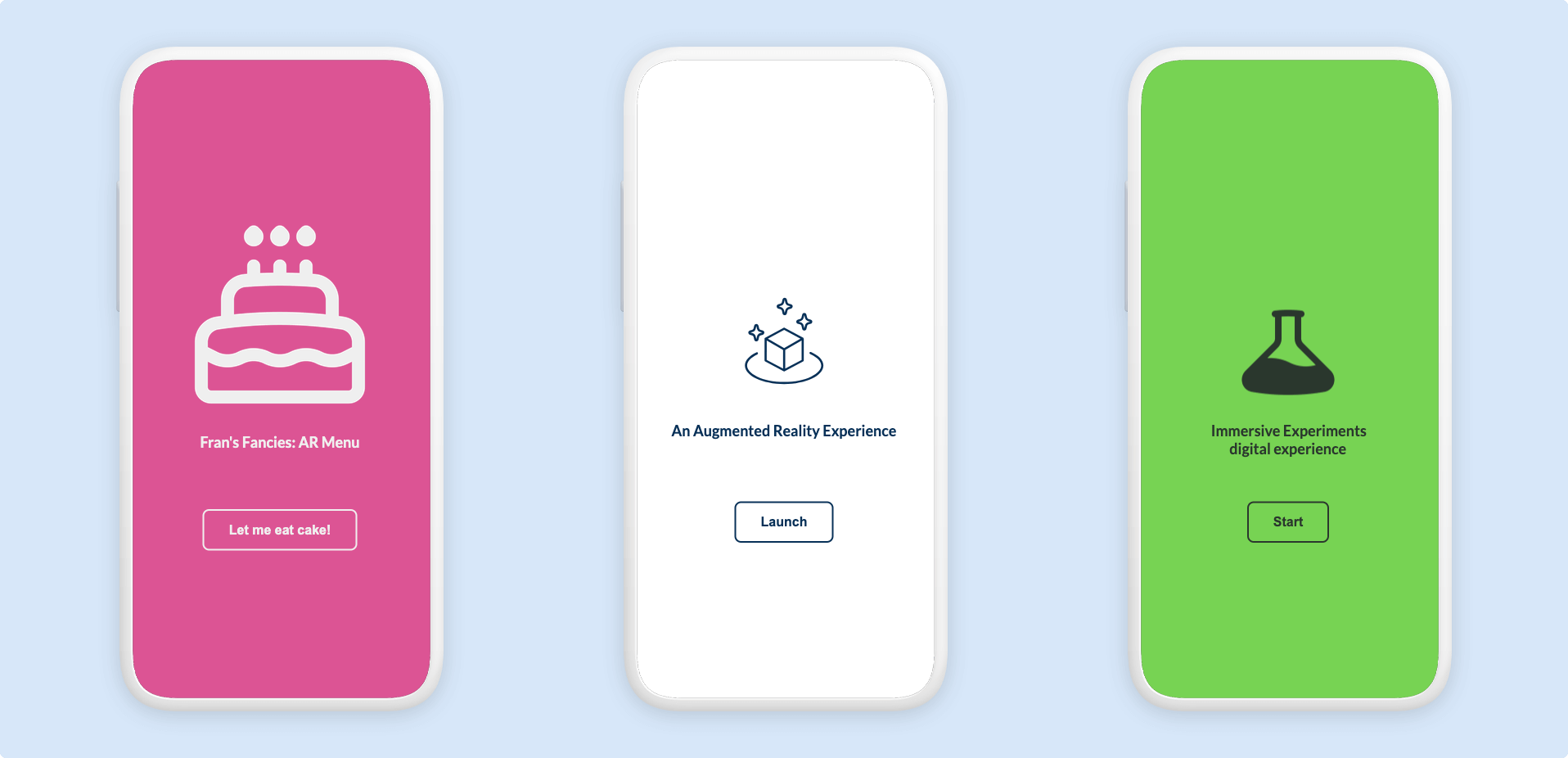
Customize the Launch Screen
Custom launch screens for your Zapworks Designer projects are essential for capturing your audience’s attention. The launch screen serves as the first impression of your immersive experience, and Zapworks Designer’s customization options allow you to tailor it to your brand and project identity.

Enhanced WebAR Distribution (fully custom) launch screens can also be found under the Launch Screen section in the Global Settings panel in the Zapworks Designer editor.
Steps to customize your Launch Screen
Section titled “Steps to customize your Launch Screen”To customise your project’s Launch Screen, use the following steps and watch the video below:
- Open your project in Zapworks Designer and navigate to the Global Settings panel.
- Look for the Launch Screen section in the Global Settings panel and click on it if not already open.
- Hover over the existing Launch Screen and click on the Edit button.
- Follow the guides in the Customise launch screen modal to personalize your Launch Screen.
- When you have finished customizing, click on the Save button to submit your choices.
- Preview your project to test the whole experience and then Publish your project to make the Launch Screen visible when your users launch your experience.
Make sure to Publish your project after you have saved and submitted your newly customized Launch Screen to ensure that it is visible when your users launch your experience.
Customizable attributes
Section titled “Customizable attributes”Zapworks Designer allows you to customize many parts of your launch screen in order to align with your brand and project identity. The below table details what parts of the Launch Screen are currently customizable:
| Attribute | Description |
|---|---|
| Graphic | The graphic which will be shown above the title of your experience. We recommend a .jpg or .png format with dimensions of 512px x 512px. |
| Graphic size | How large the graphic appears above the title of your experience. Options are Medium or Large. |
| Title | The text to display as a title for your experience. |
| Button text | The text to display on the Launch Button of your experience. |
| Background color | The color of the entire background of your Launch Screen. |
| Text and element color | The color of the text and other similar elements on your Launch Screen. |
Launch Screen Best Practices
Section titled “Launch Screen Best Practices”A well designed launch screen is crucial, as this page will directly impact the user’s first interaction with your AR experience.
The following best practices ensure that users are engaged and eliminates friction during the initial launch phase:
- Maintain consistent branding with your main experience - Maintaining visual consistency between your launch screen and main experience creates a smooth, professional transition that reinforces your brand’s identity.
- Ensure text is readable against the background - Choose high-contrast color combinations between text and background to ensure readability. For example, use dark text on light backgrounds or vice versa, and avoid similar shades that could blend together.
- Keep text concise and clear - Keep launch screen text brief and direct to minimize cognitive load and help users quickly transition into the AR experience.
- Optimize image sizes for quick loading - Use appropriately sized and compressed images to ensure that your launch screen loads quickly and smoothly, preventing user drop-off due to long loading times.