Organizing your Content
Screen UI can be used creatively to enhance your projects with a variety of components with intricate placements. As such, your canvas can become cluttered quite quickly. Organizing your components and thinking about some UI considerations for the overall user experience is important.
Anchoring Components
Section titled “Anchoring Components”Keeping your Screen UI consistent across different devices is another important aspect of creating a friendly user experience, and the Anchor Pins property setting allows you to do so. Use it to pin your components to specific edges on the screen and adjust their position from that edge. This will ensure they appear in the same area on any phone, regardless of screen size.
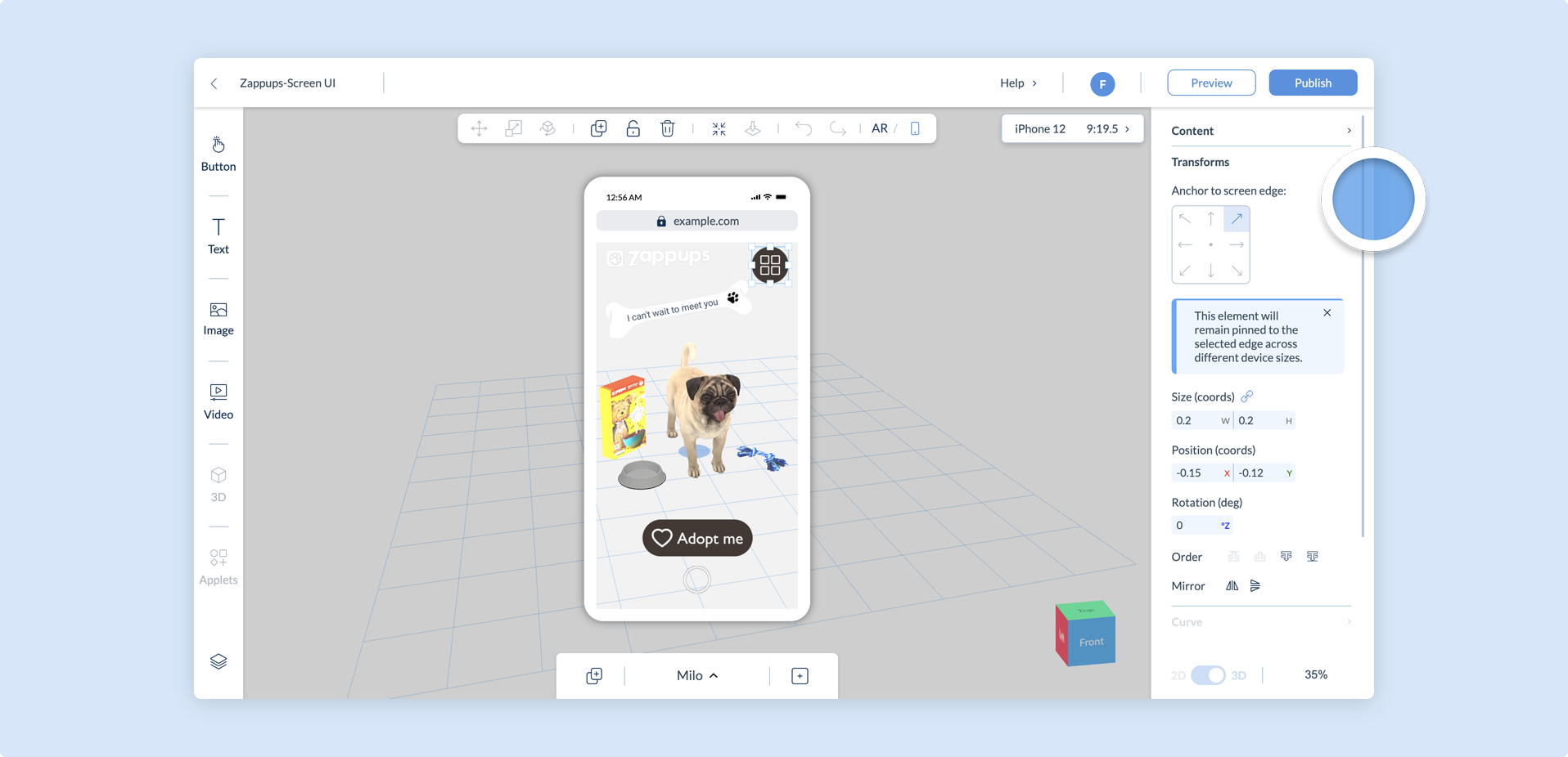
Components are pinned to the selected edge from their center. You can then use the Position property to set the X and Y distance of the component from its pinned region. The videos below demonstrate how a component anchored to an edge behaves in comparison to an unpinned component on different aspect ratios.
When components are added to the screen layer canvas, their default anchor pin is the center.
Organizing Components
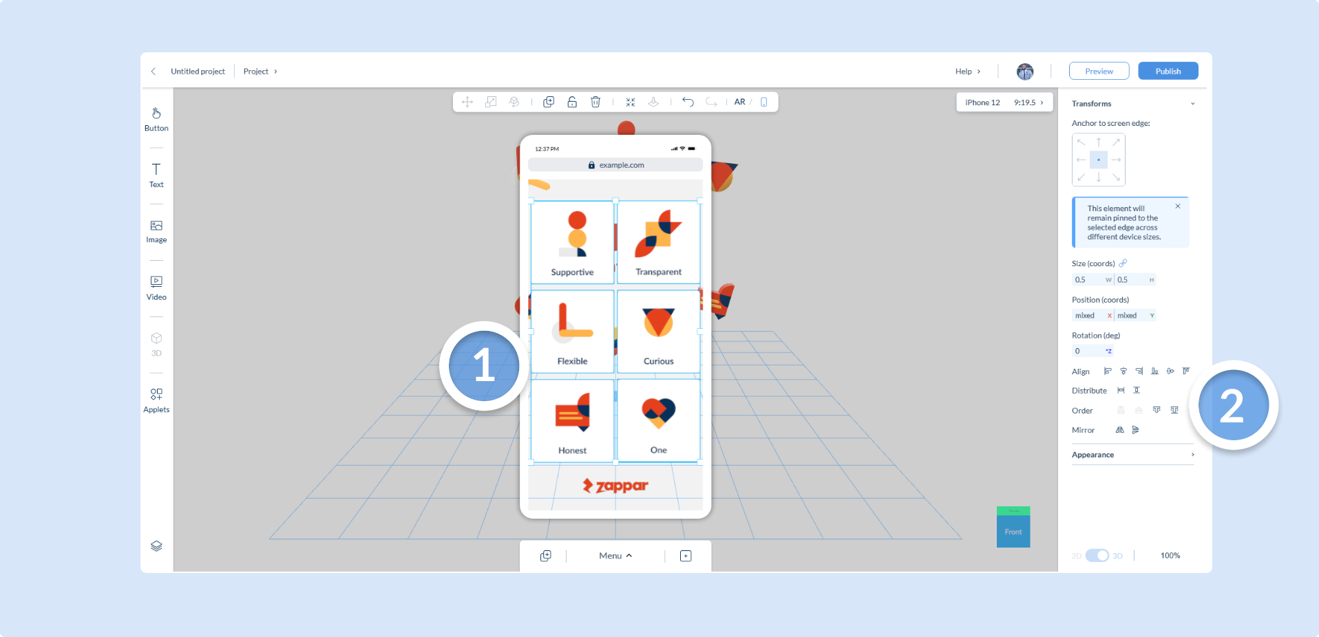
Section titled “Organizing Components”You can multi-select multiple components on the screen layer by simply holding the right mouse button and dragging the mouse over the components you want to adjust. This feature allows you to select multiple components and use the Properties panel to modify some of their attributes all at once.
However, it’s important to note that only the common properties shared by all selected components will be available for adjustment. Any unique property specific to a certain component type will not be accessible when multiple components of different types are selected.
This is particuarly useful for creating menu scenes, by enabling you to easily organize and align components with the Transforms property setting.
Duplicating Screen UI to Scenes
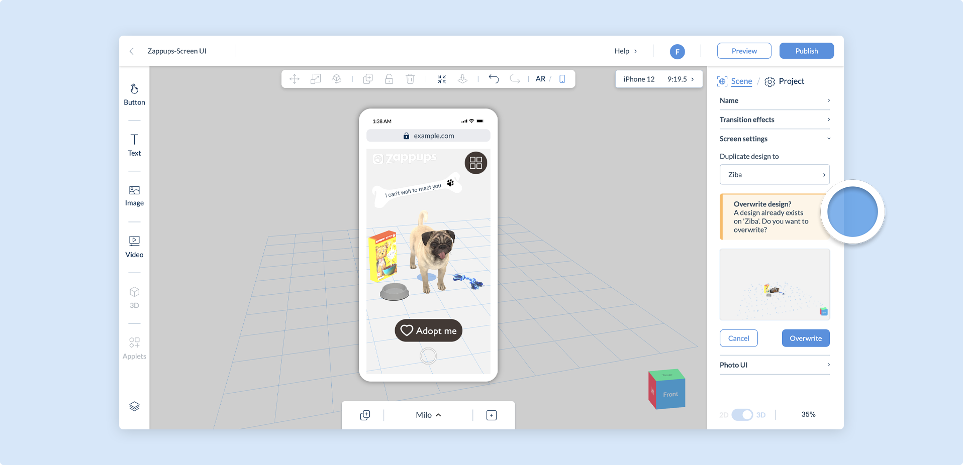
Section titled “Duplicating Screen UI to Scenes”You can easily duplicate your entire Screen UI from one scene to another using the Duplicate design function in the Scene Settings Panel. Your Screen UI components are duplicated to the scene(s) you choose, as well as any property settings they have, such as Actions.
Duplicating to a scene that already has Screen UI components will overwrite them. The warning below will appear if you try to do this.
If you duplicate your 3D scene in AR mode and it also has components in Screen UI mode, the Screen UI design of this scene will also be duplicated, along with all of its Components and their properties.
Considerations
Section titled “Considerations”Whilst this new dimension creates new ways to engage users, there are some careful considerations to make with 2D elements on the screen; particularly regarding their placement in relation to the 3D scene and any default UI provided by Designer.
World Tracking Place and Reset buttons
When viewing a World Tracking scene, the default Place and Reset buttons for all Designer projects will still appear in Screen UI mode and cannot be moved or adjusted. It is recommended that you preview your project to confirm your other UI components are not overlapping with it.
Photo UI
Both the capture button and the Snapshot Controls once a snapshot has been taken might interfere with other UI assets.
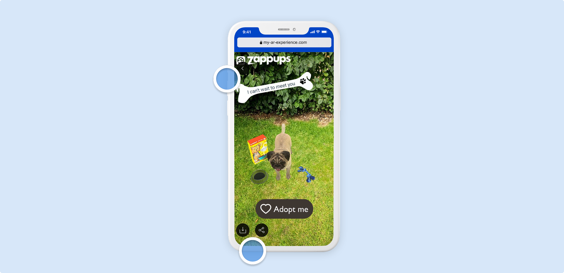
If you require the Save and Share functionality in your experience, it is recommended that you enable Photo UI first before adding any other Screen UI assets so that you can organize other UI components effectively.
Lastly, preview your experience often to make sure your UI assets are not being blocked.
You can use a different component with an Action set on it to use the Save and Share functionality without the default capture UI. The Snapshot Controls however will remain the same. Find out more on the Actions article.
Continue reading our documentation to take a look at some Screen UI example use cases.