Zapcodes
By default, when a new project is created in ZapWorks, regardless of the initial trigger selected, a zapcode is created for the project.

Zapcodes can be scanned via the native Zappar app or Zappar's WebAR platform.
Zapcodes with ZapBox experiences published to them must be scanned from within the ZapBox app (available on Android and iOS).
Including an experience's zapcode within its tracking image design improves the stability of image-tracked experiences. For other types of tracked experiences, the zapcode still serves a purpose as the all-important call to action.
Customising your Zapcode
One of the key benefits of zapcodes is that the design of the code is more appealing to the viewer than the industrial, purely functional design of traditional barcodes.
However, the default black & white style might not be the best choice for every design. Before trying out different designs, it's important to understand what's happening when a zapcode is being scanned with Zappar.
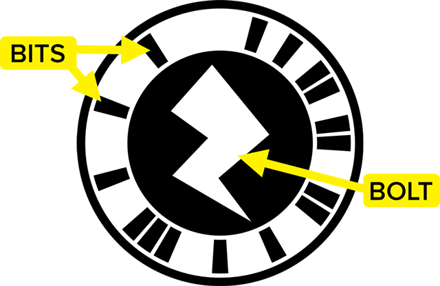
The Bolts and the Bits


Color Change
To work correctly, the code must have good contrast between the background (light colour) and foreground (dark colour). Black on white provides the maximum contrast, but it’s ok to change these colours.


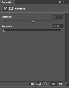
To best mimic the way that Zappar sees grayscale, use a ‘Vibrance’ adjustment layer in Photoshop. Leave the Vibrance setting at 0 but reduce the Saturation down to -100.


Bit Extension
Another useful thing to note is that the ring around the outside is purely aesthetic, so these two zapcodes are both valid:

Integrated Design
Now let’s take a look at how we can use this knowledge to deeply integrate the zapcode into some artwork. This is the front cover of our ‘Little Book of Zaps’, and the character on the front is sporting an unconventional looking code. This code has 3 main colours (which are close enough to two when viewed in grayscale).


This code also displays two more key changes. The bits are being sent in different directions once they’re far enough away from the bolt; the app still sees them when expected.


In addition, the small gaps between the bits have been merged together - this will only work on bits that are immediate neighbours.